Visiting a website with slow loading times is frustrating. Sure, a page with flashy graphics, slick animations, and artsy design features might look nice, but if it’s functionally limited then what’s the point?
One of the hallmarks of a great web developer is the ability to hit that sweet spot between attractive layout design and adequate load speed optimization. After all, it’s a crucial component if you’re to keep potential customers on your webpage.
That said, being a web developer requires skills that most of us don’t possess, so it’s understandable for a website owner to struggle. If you’re happy with how your website looks, it may well be falling short of performance expectations — and that’s troubling given that nearly half of us won’t wait longer than 3 seconds for a shopping site to load up.
That’s just one of the big reasons why it’s vital for your site to load quickly. Below, we’ll delve more deeply into why having a speedy site can’t be anything less than a priority. Here we go.
First Impressions Are Crucial
As noted, our attention spans are minuscule when it comes to how long we’re willing to wait for a page to load. This fact becomes even more pertinent when you consider that your business has only 7 seconds to make a positive first impression. What are you going to do with that time? What does your website look like within the first few seconds?
When you’re setting up your first website, it’s tempting to load it up with high-res images and stack the UI with special effects and animations. After all, you want it to look slick and professional — but those additions come at a cost, holding back the performance and potentially turning your site into a sluggish mess. The foundation needs to be usability achieved through a combination of fast load speed and functional UI design.
Regardless of your site’s primary purpose (be it to sell, inform, or entertain), your audience will lose interest fast if your load times don’t match their expectations. And when that interest fades, it won’t come back. It’ll be replaced by interest in rival sites that meet or exceed those expectations. Can you really afford to let that happen?
You must focus on making good first impressions, then — and to do this, you need to think about all platforms through which your visitors may view your site. Being mobile-responsive hasn’t been optional for a long time. Use Google’s free mobile-friendly test to ensure you’re catering to mobile visitors, and generally make an effort to provide strong functionality regardless of how people choose to interact with your site.
If you can do this, your hard-earned traffic won’t go to waste. Leads will be impressed by your website and act upon that by sticking around and becoming positively inclined towards your brand. Start as you mean to go on.
Speed Affects Your Search Rankings
Whether you’re an SEO whizz-kid or you’re less familiar with how search engines dictate rankings (you can learn more here, so take a look), upping your page speed is a simple and effective way to get your website seen more frequently. Improving performance will help your page appear higher up in Google’s results pages (other search engines are available, though perhaps not consequential).
Why? For starters, Google actively penalizes any sites with slow load times because they provide a terrible page experience for users. Visitors simply don’t want to wait around, so you can expect your page to appear further down the results page if your website is a little sluggish. And if someone does stick around, they’ll be less likely to convert (more on this soon).
How can you fix this, then? One of the best ways to give your site a quick boost is to take a look at your hosting provider. If it’s been a while since you set up your page, it may be worth investing in an upgrade.
Many hosts have blisteringly fast response times, but we’d recommend choosing a host based on their individual features, as many providers specialize in different areas, making them more suited to different niches. For instance, if you’re running on WordPress, Cloudways can pair a free migration with a baked-in Cloudflare integration to deliver strong and secure performance throughout the world.
If you’re not looking for the fastest WordPress hosting, or even the most secure, you can find something less complicated. It’s important to do the research to find something that suits your exact needs. PC Magazine has a good roundup of current options that can give you an idea of the pros and cons of each provider, helping you make the right choice for your eCommerce site. However, it’s important to do your research! Use a comparison site to weigh-up the pros and cons of each provider to ensure you make the right choice.
Faster Load Speed Means Higher Conversion Rates
Run an eCommerce store? Ensuring your website loads quickly should be one of your highest priorities. A study from Google found that a speed increase of just 0.1 seconds can boost the number of shoppers adding items to their baskets by more than 9%. Staggeringly, a 100-millisecond delay can result in a 7% decrease in conversions. Take a look at these conversion rates based on load times sourced from recent research:
Page Load Time (in seconds)
Conversion Rate
2.4
1.9%
3.3
1.5%
4.2
1%
5.7+
0.6%
Of course, this is less of an issue if you’re not trying to sell anything. Given the stats though, we reckon that’s unlikely — online retail sales are set to grow 50% in the next 4 years, with the current market value of the industry recorded at $4.9 trillion. And if you’re not planning to ever sell any products through your site, you’ll still want to monetize it in some way to take advantage of the traffic. Doing otherwise is leaving money on the table.
In addition to following the aforementioned steps, you should keep an eye on your image sizes. Using image compression plugins (or sites such as TinyPNG or Squoosh) can help you avoid using more space than you need to, cutting back your required server resources and giving your website visitors better experiences.
If you’re using WordPress, a free plugin like W3 Total Cache can also help you to cache your web pages. This is one of the best ways to speed up your website, as caching stores copies of all the bulky files on your site. This reduces the load on the host’s servers when a user loads your page, ensuring that load times are minimal. [Editor’s note: another one we like is WP Rocket.]
Website load speed matters — hopefully we’ve been able to convince you of that! Find that balance between great design and optimized content, and we’re sure you’ll have no trouble keeping the attention of any visitors that come your way.
About the Author
Rodney Laws is an ecommerce expert with over a decade of experience in building online businesses. Check out his reviews on EcommercePlatforms.io and you’ll find practical tips that you can use to build the best online store for your business. Connect with him on Twitter @EcomPlatformsio.
If you found this helpful, please share it with the social media links on the left or the Click-to-Tweet above.
How has your experience been with this? Join the discussion in the Comments below.
You’re probably not a professional writer, so you may be excused for not realizing if your website copy isn’t “readable”. After all, it’s in plain English, right? But readability is more than that.AJ Kohn points out the importance of readability on your website:
Readability is about making your content accessible and comfortable. Never make it a chore. If you make your content difficult to read the value of that content goes down. Lack of readability frustrates comprehension and reduces sharing. This, in turn, limits the social echo of your content and lowers the chances of it obtaining organic links.
Here’s your clue: Heed the warning sign of a high bounce rate.
If poor readability is driving away visitors on your website, the clue will be a high bounce rate — the percentage of visitors who leave immediately after arriving on a page without looking at anything else on your site.
If you have a bounce problem, you may have a readability problem.
When readability is compromised, you’re also losing valuable visitors who are all potential customers.
Readability is certainly related to the words you use and your sentence structure; that may determine the reading level or grade of your content. But it’s much more than just that. There are things other than your words that can make your content easy to read or difficult to follow.
Here are some important readability factors to consider
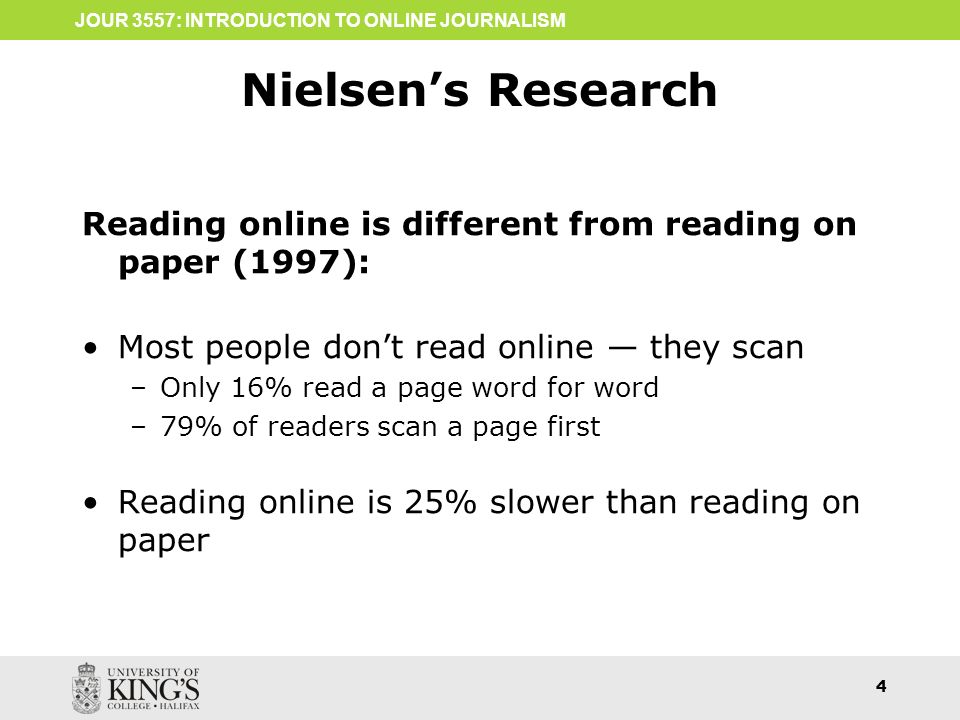
People Don’t Read, They Scan
It’s important to structure your writing to make it easy for people to scan down the page and quickly find the information they need to read carefully. They usually start with developing an understanding of the page layout and navigation and perhaps looking at images.
Noted usability expert Jacob Nielsen conducted a study that found that users “read at most 28% of the words during an average visit; 20% is more likely.”
Use Font Size Smartly
Headings and subheadings need to be clear. You need a hierarchy of font sizes, and possibly even colors and boldness, to help the reader immediately grasp the structure of your content. I start with a body font size of 16 points in my own blog, and headings & subheadings are clearly larger. Also, think of your headings as representing the structure of your content, much like an outline.
Use Subheadings
Subheadings don’t just visibly demonstrate the structure of your content. They also improve your readability by making your content less dense and, as a result, less intimidating.
Use a Legible Font
Getting fancy with your fonts can easily become counterproductive.
Avoid infatuation with artistic fonts. Make sure your body text and headings are all legible. Some fonts become difficult to read in bold, and research has shown that some fonts that are easy to read on paper are not as easy to read on a computer screen.
My preference is for serif fonts for printing and sans serif fonts for web content. Simple is better; I recommend fonts like Arial, Humanist, and Century Gothic. I typically use the same font family for headings. But since headings are larger you may be able to take more leeway there. Here are some font suggestions to consider.
Pay Attention to Line Height
If the lines of text on your screen are too close together, that reduces your readability. A good rule of thumb is to use a line height of about 1.5, but that can vary depending on your choice of font. The goal is to avoid your text looking cramped or looking too spread out.
Watch Your Color Contrast
An actual example of poor readability because of insufficient color contrast.
Be cognizant of your text color in comparison to the background color. Inadequate contrast can have a dramatic impact on readability and eye fatigue.
I like black text on a white background, and absolutely hate the popular fashion of using gray text instead of black. Colored backgrounds are fine, but pay attention to the color of the text to make sure it’s easily readable.
Use Highlights
Don’t be afraid to italicize or bold important words or phrases – or even whole sentences – so that your most important content stands out. If you’re particularly brave, you might decide to use color or highlighting so the importance stuff jumps off the page.
Shorten Your Paragraphs
Nothing is worse than a paragraph that rambles on and on and on. You may be familiar with the expression TL;DR. That stands for Too Long; Didn’t Read. That almost always means the content is too dense and paragraphs are too long. Three or four sentences is about as long as you might want your paragraphs to be.
And don’t be afraid of one-sentence paragraphs either.
Just like a long paragraph, a long sentence compromises readability. If the user has to parse the sentence grammatically to understand it, it’s too long. The Yoast SEO plug-in for WordPress discourages too many sentences that are more than about 20 words. I agree. A couple of long sentences spread across the entire page or blog post are okay, but too many of them can drive people away.
Use Pronouns With Care
Be careful with pronouns in your content.
In a conversation, it’s easy to know what pronouns are referring to. If I talk about that here, the “that” obviously relates to using pronouns. That’s the antecedent. But if the antecedent is in a previous paragraph, and the person scanning through your content alights on the current paragraph, they’ve missed the antecedent. It’s not obvious what the word “that” is referring to.
Repeating nouns instead of referring to them with pronouns may have an added benefit in that nouns are more valuable to the search engines understanding your content than pronouns are. Just try to avoid being “over-redundant”with those nouns.
Preserve Some White Space
Your content – and your readers – need a little space to breathe. Inadequate white space on the page is one of those things that triggers the TL:DR response. Headings and subheadings, bullet lists, and images all help to increase white space on your page.
Avoid Distractions
In general, you want your visitor to read and absorb your content. You may want them to take action, like download something or buy something, or contact you. Don’t break the flow of your user’s concentration on your content. Distractions are a conversion-killer.
Sliders with rotating images, colorful banner ads, and pop-ups that obliterate some of your content are almost always counterproductive. Be particularly careful about pop-ups. Google refers to those as “intrusive interstitials” and they can damage your page experience. That’s important because page experience is a new and increasingly important part of Google’s ranking algorithm.
Images Can Help Readability
Images can make your content less intimidating and more approachable.
Always use at least one image on every page. I like to insert images with text wrapping around them. They serve many purposes — they can:
Effectively illustrate a point you’re making.
Draw the eye to a particular spot on your page.
Make your page more memorable.
Add a little white space around the image, and white space makes content less intimidating.
Make a long paragraph appear less dense.
Add color to a mostly black-and-white page.
Make your page more approachable which translates into better readability.
Maintain Paragraph Transitions
You don’t want staccato content. Your material needs to flow, to maintain the focus of your reader and ensure comprehension. So try to ensure a natural for progression from paragraph to paragraph by using transition words like ‘and”, “so”, “because”, and even “thus” or “therefore”.
When you maintain that flow, you retain the reader’s attention.
Pay Attention to Your Reading Level
There are a few ways to judge the reading difficulty of your content:
How many sentences in the paragraph?
What’s the average number of words in a sentence?
How many syllables in a word (on average)?
There are a number of tests to determine your reading level. Perhaps the most widely known is the Flesch-Kincaid readability test. That test calculates a reading grade level, calibrated for US readers. The Yoast SEO plug-in for WordPress evaluates reading level using the Flesch reading ease score.
You can get a reading level score online at a few places:
Keep your keyword phrases in mind, but whatever you do, avoid keyword stuffing in a misguided attempt to get better rankings in Google. Not only is it a readability nightmare, it’s also a red flag to Google that can hurt your visibility rather than help it.
Results
The goal of improving your readability is not just to get your point across. You also want to encourage the reader to do something.
Perhaps you want your reader to subscribe to your newsletter. Maybe you want them to call your office to ask questions or request a consultation. Or perhaps you want them to buy a product.
The goal of your carefully constructed readable content is to entice the reader to move down the sales funnel and take the action you want.
Make sure you include appropriate and compelling calls to action on your page for your reader to take the action you want them to.
Need help with your search visibility? At Rank Magic we’re the SEO experts for small businesses and startups.Reach out for help now.
Find this helpful? If so, please share it with the buttons on the left or the Click To Tweet above.
We welcome your thoughts in the Comments section below.
There’s a new algorithm change at Google scheduled for next May, and it promises to be a big one. Google calls it the Page Experience factor and we introduced it in this blog a few months ago. Much of what’s involved in page experience used to be referred to as user experience, or UX.
Perhaps the most important thing to understand about page experience is that not only will it help you to rank better in search results, but it will also help retain visitors on your site. A good page experience encourages visitors to read more on your site and visit more pages. And that’s highly correlated with conversions of those visitors to paying customers.
Let’s look at seven specific things you can do to make sure you have a healthy page experience and can demonstrate that to Google.
1 — Mobile Friendly
More than half of all website visits are happening on cell phones. As a result, Google’s index of website content is looking only at mobile friendly content. If your website isn’t mobile friendly, it’s awkward to use on a phone and people are likely to abandon you and look up a competitor instead. For that reason and others, Google is reluctant to rank highly websites that aren’t mobile friendly. In general, I recommend a responsive site rather than having a separate site for mobile users that’s at all different from your desktop version.
2 — Core Web Vitals
One of the most important page experience factors is your page download experience, and core web vitals grade you on that. Google scores this based on three things:
Loading
How quickly the page displays in your browser or on a phone — in technical terms, “largest contentful paint” (LCP), or how long it takes before you have a full screen displayed. If your page displays a temporary splash screen or a loading indicator, that doesn’t count. This measures how long it takes before you have a meaningful screen. To be acceptable, this should be no more than 2.5 seconds.
Interactivity
First input delay (FID) measures how long it takes before it’s interactive (meaning responsive to your actions on the page). A page is not always usable immediately upon being displayed; for example, buttons may not work until additional code has been loaded. To be acceptable, this should be no more than 0.1 seconds.
Visual stability
This is measured as something called “cumulative layout shift” (CLS). In some websites, you may be ready to press a button when all of a sudden things move on the screen and that button is no longer where it used to be. Sometimes after the page loads, pop-ups may show up that interfere with using the page. Instability of objects on the screen is a negative experience factor. This is measured by the relative size of the unstable element and how much it moves. To be acceptable, this score should be no more than 0.1. Some of this is a function of your website itself, but some may also be a function of your web hosting company. For most of us, this is the technical stuff that we leave up to our web designer or web host. To check how your own website stands up to these, there are a number of tools you can use. Google offers six ways to check your core web vitals.
If you’re not a technical person, I suggest asking your web developer to let you know how you stack up. And if your site needs work, I encourage you to have them deal with it because this may be the single most important part of Google’s new page experience score.
3 — Readability
Poor readability is an important reason for users to abandon your page and look elsewhere for what they need. When someone finds your page in search results and immediately bounces back to the search results to choose something else, the search engines understand that to mean that your page was not a good match for that search. And it’s less likely to be shown for that search in the future.
A key measure of readability is the reading level, usually expressed as a grade level. Unless you’re writing a technical thesis, you don’t want your writing to be at a grade level 13 or higher. In general you should target a grade level of no higher than eighth grade. A quick and easy test for your web pages is available at WebFX.
Unfortunately, this is not usually something you can delegate to your web team. It requires your subject knowledge, and often the assistance of a professional copywriter can be invaluable. However, we can offer some specific readability suggestions here.
4 — Clarity
Beyond the reading level of your content, it also needs clarity. Is it easy for the reader to determine the point you’re trying to make? People typically scan content first to decide whether to read it carefully. A web page that’s set up for quick and easy scanning makes that easy.
The use of headings and subheadings can help a user quickly scan down the page to get to where they need to read carefully. Having short, punchy paragraphs, enough white space around it, and supportive images makes content easier to digest than long, dense paragraphs. You don’t want to have someone look at your page and conclude TL:DR — “too long, didn’t read”.
Avoid belaboring the point – don’t go off on tangents either. Mark Twain once said, “I didn’t have time to write you a short letter, so I wrote you a long one.” Take the time to write with clarity.
5 — Intrusive Interstitials
You want to avoid these. But it’s not immediately obvious what they are. Interstitials are usually screens that pop up in between pages as someone navigates through your website. Sometimes they pop up before the home page is displayed. Often they’re ads, but sometimes they’re something helpful like an offer to chat with a live person.
Pop-ups are not necessarily bad if they’re small enough. The problem is intrusive interstitials that are so large that significant portions of the content are obliterated by them.
On a responsive website, pop-ups that aren’t intrusive in a desktop browser may be very intrusive on a phone. That’s something to keep in mind because Google’s index is based on the mobile version of your website.
6 — Safety
If your website gets hacked or contains malicious software, you can count on getting weeded out of Google’s search results. Make sure your website and your web host are safety conscious and have appropriate protective software in place.
If your website is designed in WordPress, I recommend the WordFence security plug-in to alert you whenever security updates are available for your website or any of the plug-ins it uses. Your web designer can make other recommendations about what’s appropriate for you.
7 — Security
Security has to do with encrypting data that travels between your website and the user’s computer or phone. A secure website has a Secure Socket Layer (SSL) certificate. It’s easy to tell because if it does, the address of your website starts with https://instead of just http://.
Originally most websites didn’t bother with an SSL certificate unless they were collecting personal data like credit card information. That’s changed now, and all websites should be secure.
If your website doesn’t have an SSL certificate, when people look at it in Chrome they will see indicator that your site is “not secure”.
Some users may infer that means your website is dangerous; you can lose potential customers that way!
Now’s the time to get ready for Google’s Page Experience algorithm update.
As of this writing, we all have about five months to get our websites ready for this significant change to Google’s ranking factors. Don’t put it off.
Feel free to share this information with the social media share buttons on the left or the click to Tweet above.
Join the conversation with your thoughts or questions in the comments below.
Google’s next big algorithm change for Page Experience is planned for launch next year. It’ll measure user enjoyment of web pages using both old and new ranking factors, grouped into a page experience score. Google explains it:
The page experience signal measures aspects of how users perceive the experience of interacting with a web page. Optimizing for these factors makes the web more delightful for users across all web browsers and surfaces, and helps sites evolve towards user expectations on mobile. We believe this will contribute to business success on the web as users grow more engaged and can transact with less friction.
So what are these page experience factors?
I’ve broken them down into nine discrete thing that a small business owner needs to address on your website. Let’s hit them one at a time.
Your site needs to be responsive and mobile friendly
A responsive site is one that adapts to the device it’s showing up on. If you open up your site in a browser and change the width of the browser window, the display of the website should respond to that. If you make the browser window narrower, you shouldn’t see it cut off the right edge of paragraphs.
This is it really obvious on a phone. Your website should look different on a phone than it does on a desktop computer. But you don’t want to have a separate mobile-only website like some people did in the early days of the smart phone. You want the same information available on a phone that’s available on a computer, since Google is using a mobile-first index.
If your mobile site is abbreviated and has less content in an effort to more easily fit on a phone, that’s the version of your site Google will index and rank. You want one website that can display differently on a computer and a phone. That way the same information is available regardless of how a customer is looking at it.
Also in terms of being mobile-friendly, it’s important that tap targets, links, buttons and so forth, are large enough and far enough apart to make it easy to tap them. If they’re too close together, your fingers are likely to hit two at once and that provides a poor user experience. The size of your text also may need to be different on a phone so that it’s easy to read.
Page speed refers to how many seconds it takes for a page on your website to download into a user’s browser or phone. Google likes to see a web page that displays on your phone or in your computer within 2½ seconds. Fully displaying in 4 seconds is considered adequate, but any longer than that and Google considers it to offer a poor experience.
From a practical matter, we live in an age of impatience. You don’t want someone clicking on your listing in search results and drum their fingers while they’re waiting for to load. They may give up before it finishes loading and go back to the Google search results. They’re likely to click on another listing and that “bounce” tells Google that they didn’t like what they found on your site. Not only did you lose a potential customer, but it’s likely to hurt your rankings in the future.
Visual stability
All across the web they are calling this “cumulative layout shift” or CLS. Let your web designer worry about those terms, but don’t let this jargon intimidate you. What this refers to is things jumping around on your screen as a page loads. It can be very annoying, as you can see on the website Media Bias Fact Check. Google considers this a poor page experience and if it’s happening on your website, your rankings will suffer for it.
[Update March 2021] I’m sure it’s not because of us, but Media Bias Fact Check has corrected their visual stability issue so it’s no longer a good example.
Avoid 404 errors
When a user tries to go to a page that isn’t where they think it is, they get a 404 Page Not Found error. If there are links on your site that point incorrectly to content on you’re website, your shooting yourself in the foot. It’s a poor user experience if you send your users to pages that aren’t there. It’s important to scan your website and make sure you clear up any of those.
Beyond that, though, there may be malformed links on other websites or links that point to pages you have since eliminated or moved. Those 404 errors are pretty much unavoidable. But you can improve the user experience of them with a custom 404 page. Unlike the default 404 error your browser provides, if you have a custom 404 page it’s formatted just like your website so users know that they haven’t been completely lost. Many websites treat this with a little bit of humor and offer to help the misled user to find what they’re looking for via a search option or a link to your site map.
Is your website secure? Google is on a mission to improve security across the web. As a result it tends to give a ranking advantage to secure websites. If your website URL starts with HTTP:// then it’s not secure. Secure websites start with HTTPS:// and insecure websites are flagged when they show up in Chrome. Many people will see the “Not secure” indicator in the address bar of their browser and mistake it to mean that the site is dangerous. You certainly don’t want that for your own website.
Boy, that’s a mouthful. Intrusive interstitials are those annoying pop-ups that block most or all of the page content when you arrive on the page. You may have run into them when loading certain websites with an ad blocking plug-in in your browser. Very often they pop up to ask you to subscribe to a newsletter, and so forth. They provide an annoying user interface, and Google doesn’t like them for that very reason.
Not all pop-ups are bad; just those that are intrusive, blocking too much content.
Readability
The Internet expression TL:DR has become popular lately. It means “Too Long: Didn’t Read”. If your web page is too long or too dense and intimidating, people may leave before they digest what you’re trying to say. That doesn’t mean you need to have short pages with little content on them. On the contrary. But you can reduce the density of the page with effective implementation of images and white space.
You also want to avoid sounding pedantic because it takes too much effort on the part of your reader. The Yoast SEO plug-in for WordPress has a very valuable feature that will assess the readability of your content and offer suggestions to make it more approachable.
Employ clear headings and subheadings
Clear headings and subheadings can go a long way toward making your material less intimidating. Users can scan the page to find the precise portion of the page they are most interested in. Odds are you scanned this page’s headings before deciding to read it. And by employing proper heading tags in the code of your page, you help Google more easily understand your page, and that can only help in your rankings.
Don’t forget CTAs
A CTA is a Call to Action and is critical in getting your users to take the action you want them to. If you’ve ever ordered a burger at a fast food joint, the cashier almost certainly asked you “do you want fries with that?” They sell a hell of a lot more fries because they ask.
So if you want someone to call you or to sign up for your newsletter, or to buy something, you need to ask them to do just that. The easiest CTAs to see are buttons, but you can also employ text-only calls to action if that fits your purposes better.
Page experience is important in so many ways
A good page experience will entice more people to read what you have to say. It will keep them engaged and on your page longer. That’ll reduce your bounce rate and increase your time-on-page, and thus will increase conversions as more people click on your calls to action.
Not only that, but Google will like your page better and rank it higher.
Get ready for Google’s upcoming Page Experience algorithm update by improving the user experience across your website now.
Facing challenges with your page experience? Start a discussion below.
If you found this helpful, please share it with the buttons on the left or the Click-to-Tweet above.
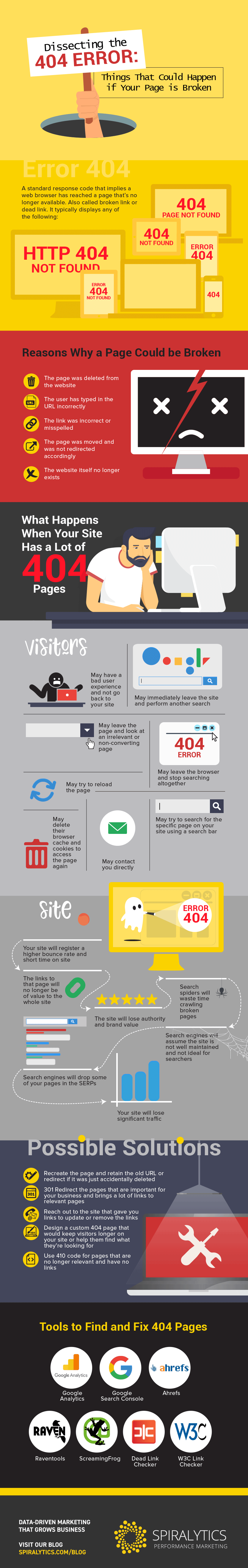
Your company website is one of the leading sources of traffic for your business, so keeping its structure healthy is a must.
You want to be able to meet your visitors’ need to have accurate information about your brand and offerings directly from your website. This way, you can move your target audience further into the succeeding stages of the buyer’s journey.
So, imagine if your prospect is ready to engage with you, but finds a page 404 error message instead of the branded content that they are hoping to see?
They’ll probably feel frustrated and disappointed, which isn’t a really good way to welcome people visiting your site. Because of this kind of negative experience, you may lose potential customers.
Google cares about 404s
Plus, broken 404 pages make your website look bad in the eyes of Google and other search engines. As a consequence of serving your online visitors with 404s, your website’s ranking on the search results may drop.
Before 404 errors escalate into a serious issue for your organization, you should mobilize your web developers to look into the problem right away. Have them check if the trouble is on your end or on the server where your website is hosted. As soon as you identify the source of the problem, you need to apply the fix as quickly as possible.
While you’re at it, you should also aim to ease the users’ difficulty in finding what they initially came for. Perhaps you can redirect them to other pages on your site, request them to reach out to you via chat, and so on. Last but not least, make sure to take precautionary measures so that the same scenario of having 404 pages show up on your site doesn’t happen again.
To have a clearer understanding of how to go about fixing problems related to 404 pages, check out this featured infographic. Infographic provided by Spiralytics
Join the conversation in the Comments below.
Want to share this? See the social media buttons on the left.


 Loading
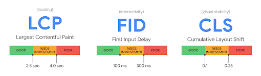 Some of this is a function of your website itself, but some may also be a function of your web hosting company. For most of us, this is the technical stuff that we leave up to our web designer or web host. To check how your own website stands up to these, there are a number of tools you can use.
  A key measure of readability is the reading level, usually expressed as a grade level. Unless you’re writing a technical thesis, you don’t want your writing to be at a grade level 13 or higher. In general you should target a grade level of no higher than eighth grade. A quick and easy test for your web pages is available at
  Beyond the reading level of your content, it also needs clarity. Is it easy for the reader to determine the point you’re trying to make? People typically scan content first to decide whether to read it carefully. A web page that’s set up for quick and easy scanning makes that easy.
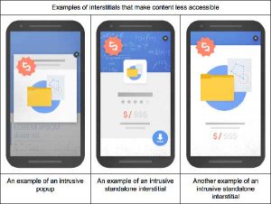 Pop-ups are not necessarily bad if they’re small enough. The problem is
  If your website gets hacked or contains malicious software, you can count on getting weeded out of Google’s search results. Make sure your website and your web host are safety conscious and have appropriate protective software in place.
 When a user tries to go to a page that isn’t where they think it is, they get a 404 Page Not Found error. If there are links on your site that point incorrectly to content on you’re website, your shooting yourself in the foot. It’s a poor user experience if you send your users to pages that aren’t there. It’s important to scan your website and make sure you clear up any of those.
 The Internet expression TL:DR has become popular lately. It means “Too Long: Didn’t Read”. If your web page is too long or too dense and intimidating, people may leave before they digest what you’re trying to say. That doesn’t mean you need to have short pages with little content on them. On the contrary. But you can reduce the density of the page with effective implementation of images and white space.
 A CTA is a
  Your company website is one of the leading sources of traffic for your business, so keeping its structure healthy is a must.